article by Varsha Kempaiah
The Indigo office in Gurugram stands as a testament to the profound impact of branding colors in office design. Beyond the mere visual appeal, this space embodies a strategic fusion of hues that resonates with the essence of the company. Let’s explore how the use of branding colors within this workspace goes beyond aesthetics to profoundly shape its identity.
Visual Identity and Consistency
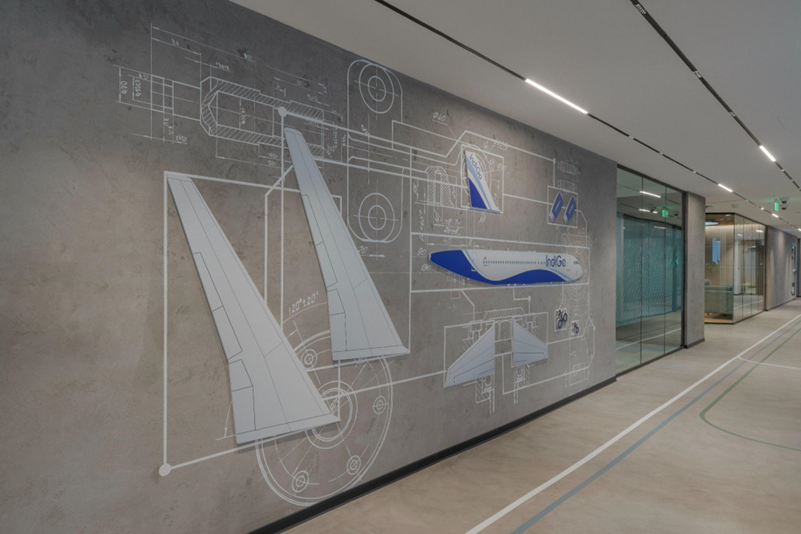
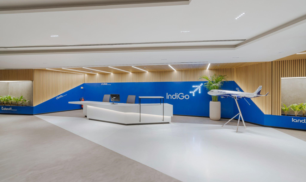
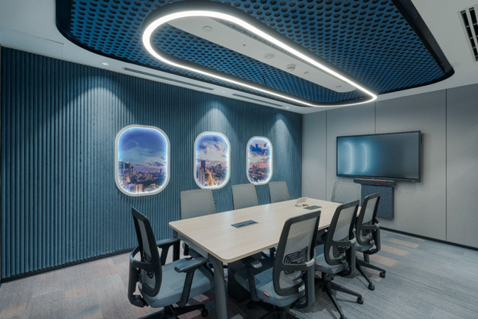
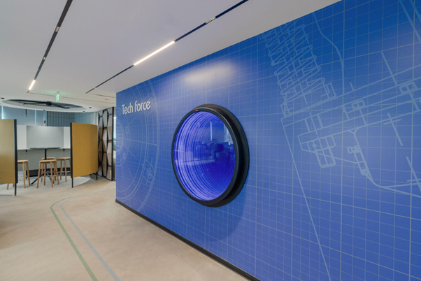
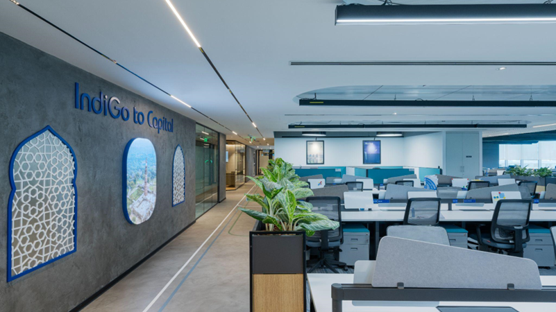
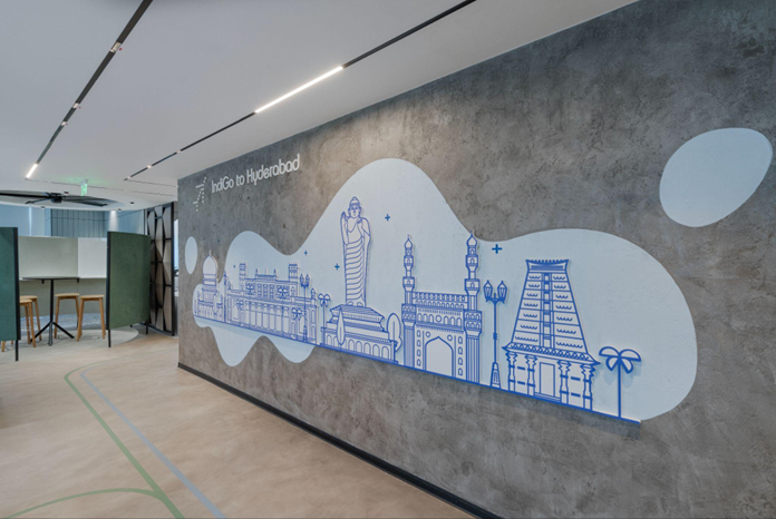
The incorporation of Indigo’s branding colors isn’t merely about decorating walls or choosing furniture; it’s about forging a cohesive visual identity. Every stroke of indigo blue and complementary tones creates a symphony of recognition and consistency. The office becomes a canvas that mirrors Indigo’s brand image, aligning the physical space seamlessly with the company’s identity.
Reinforcing Company Culture
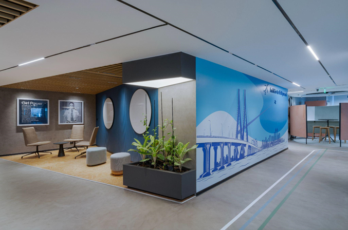
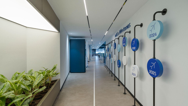
These carefully selected branding colors are more than pigments on surfaces; they embody the core values and ethos of Indigo. They silently communicate the company’s culture, becoming a visual narrative that resonates within the workspace. Each shade tells a story, connecting employees and visitors alike to Indigo’s journey and principles.
Employee Engagement and Pride
Surrounding employees with these familiar branding colors fosters a profound sense of belonging and pride. It’s not just about creating a visually appealing space; it’s about nurturing a connection. The indigo hues become a badge of honor, instilling a sense of ownership and loyalty among the team, elevating their engagement and commitment.
Brand Perception and Professionalism
The visual appeal of the Indigo office transcends internal dynamics; it shapes external perceptions. Visitors, partners, and clients perceive the space as a reflection of Indigo’s professionalism and solidity. The consistent use of branding colors projects a strong brand image, leaving an indelible impression that aligns perfectly with Indigo’s identity
Integration of Brand Typography
In harmony with colors, the use of brand typography further solidifies Indigo’s presence within the office. Typeface choices, aligned with the brand guidelines, reinforce the visual language. From signage to internal communications, brand typography extends the brand’s identity, amplifying its voice throughout the workspace.
The Indigo office design in Gurugram beautifully demonstrates the strategic utilization of branding colors to shape identity and culture. Each hue resonates with Indigo’s story, values, and aspirations, transforming the workspace into a living embodiment of the brand. From walls to typography, the office stands as a testament to Indigo’s commitment to its identity, weaving a narrative that deeply connects with all who enter.